

Replace your complex bar chart with a dot plot to make it better understood
The alternative to bar charts that works well with complex data

Bar charts are used for nearly every situation, which means sometimes you’re struck by monstrosities like this:
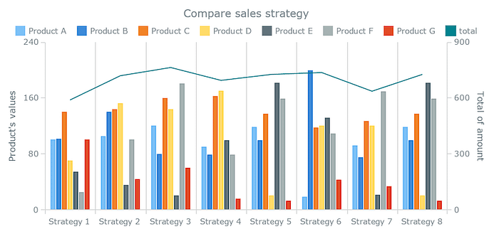
Working with data visualizations often means working with bar charts, which can get boring after a while. Work with multi-variable bar charts, and you’ll wish for something easier on the eyes.
Luckily, there’s an alternative to bar charts that accomplishes both of those things. Many people prefer it to bar charts, especially when your data becomes more complex: the Cleveland dot plot.
Understanding dot plots
The dot plot came about as a result of a few different forces at work. The first of which was a concern over the accuracy of visual cues. In the early 1980s, William Cleveland and Robert Mcgill published a piece that talked about the accuracy of certain visual cues.

Cleveland noted that people are a little better at judging position accurately than they are at measuring length. The other influencing factor at the time was Edward Tufte and his famous “data-ink ratio.”
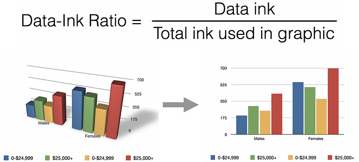
In simple terms, the less ink used for things other than the data, the better. These two ideas, accuracy and less clutter/ink, contributed to what is known as the dot plot.
The dot plot replaces the bars of the bar chart with dots, and it has 3 main advantages:
- Reducing clutter
- Being able to have a non-zero base
- Being able to visualize multiple points easily
All 3 of these advantages work together to provide a better alternative when the data you’re showing begins to get more complex.
Dot plots vs. bar charts
Bar length is a great way of encoding data, but it becomes less valuable when you have to represent more values or categories. For example, if I just showed you this bar chart, you could estimate the two categories and compare them.

Even if you didn’t have the exact numbers, you could estimate that the purple bar is 5x longer than the grey one. This is the strength of using length as a visual cue. But when you begin to have many more categories, the advantages of using bar length start to fade away.
When we look at a bar chart with multiple categories, we’re often not paying attention to the individual bar lengths. We’re just paying attention to the endpoint which represents the total value.
As a result, the dot plot and bar chart offer similar value to readers when there’s one data category, leaving it up to personal preference. But what if we wanted to show two variables for a category? This is where the data-ink ratio starts to become an issue, and dot plots begin to shine.
Here are a few ways you might consider use bar charts with two variables.
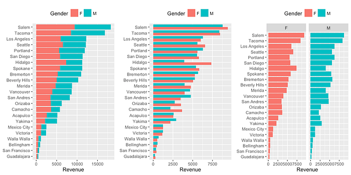
We can begin to see that these alternatives often require either a lot of space or ink. However, look at what happens when we use a dot plot.
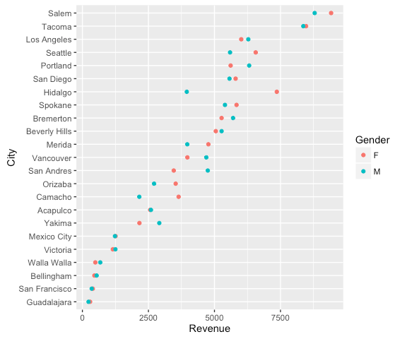
We not only use a lot less ink but there’s also a whole lot more room to work with.
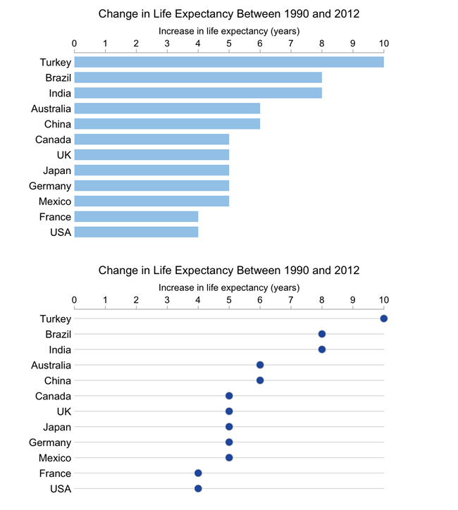
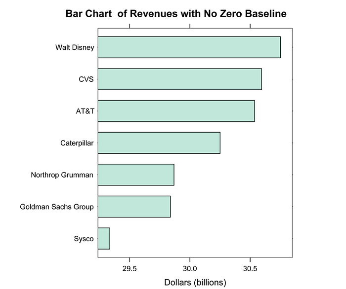
The dot plot becomes even clearer when you consider another one of its advantages: it doesn’t have to start at the zero baselines, unlike bar charts. This can allow for even greater clarity, especially if the data is grouped around certain points.
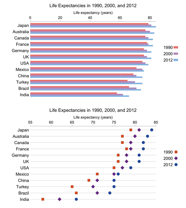
The dot plot here is much more readable when the axis is shifted to start at 55 years instead of 0, allowing for easy comparison of variables. We can’t do the same thing with our bar charts without skewing reader perception because the length of the bar is how audiences compare values.
You can even add lines to connect the two plots. We can often use this to compare the difference between the two points.

What’s the point of dot plots?
Dot plots are a viable alternative to bar charts that uses less data-ink.
Some, including Cleveland himself, argue that dot plots are superior to bar charts. They allow for more accurate interpretation by making labels easier to read, reducing clutter, and allowing more whitespace.
So why aren’t they used more? The main disadvantage of dot plots is that they aren’t as familiar as bar charts. Audiences unfamiliar with them may meet them with confusion or resistance, so you have to consider the specific situation and label and explain the dot plots well. But they offer a very distinct advantage when it comes to categorical data with multiple variables. The clarity you get when shifting away from bar charts is definitely a reason to consider using them.
So if you’ve ever been overwhelmed by color fatigue and data overload with more complex data, consider using dot plots. They might just save you a headache trying to process the data.
Kai Wong is a UX Specialist, Author, and Data Visualization advocate. His latest book, Data Persuasion, talks about learning Data Visualization from a Designer’s perspective and how UX can benefit Data Visualization.